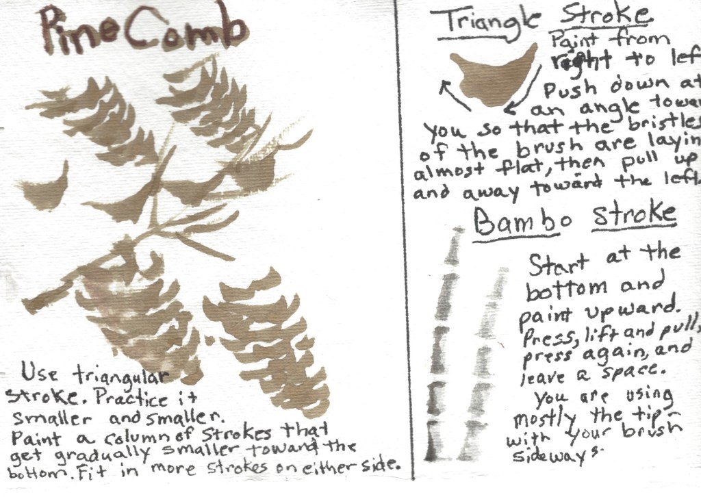
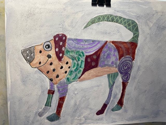
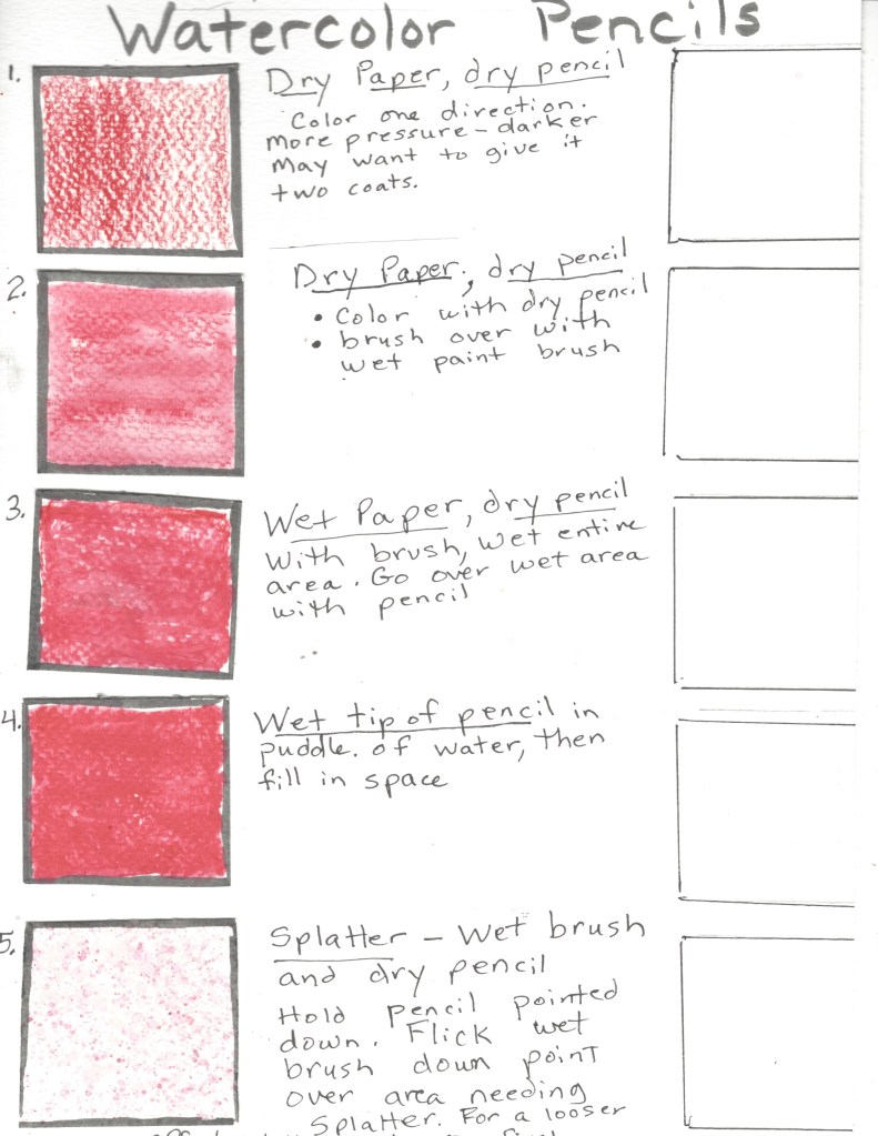
Watercolor Painting lessons
Fall Project
Technique Focus- Lifting paint
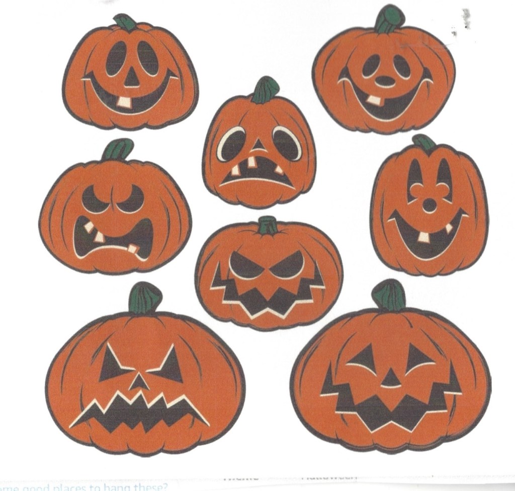
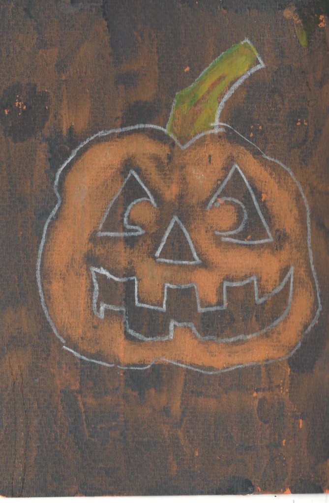
Once the watercolor is dry, you can lift highlights in small areas. Some colors, like green, are staining, and do not lift as well. Basically, you wet a brush and in a sweeping stroke, take the paint off. Sometimes you may need to blot with a paper towel. Do not scrub. Here is a Halloween card project. Mix orange watercolor with liquid acrylic gesso. Paint the entire front of the card with the mixture. Let this dry throughly. Then pant a layer of black or paynes grey over the entire front. Let this dry. With a white or orange colored pencil , draw a jack-o-lantern.Wet your brush and lift off the black to reveal the orange pumpkin. Remember to leave the eyes, nose and mouth black
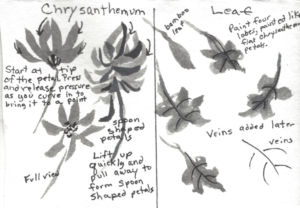
Sumi-e Painting
The Brush Dances and The Ink Sings:The goal of Sumi-e is to capture the essence, or spirit, of your subject matter. Don’t be concerned with drawing exactly what you see. Sumi-e is a very spontaneous and expressive art form.
- How to hold the brush: Hold it upright (90 degrees) with your thumb to one side and the index and middle fingers on the other side. Holding it in this position allows for a greater range of motions.
- Moving from the shoulder: Just like in drawing, you need to make your movements come from the shoulder in a loose motion.
- Loading the brush: Dip the brush into the ink cup. Use the side of the cup to shape the brush to a point and to remove extra ink.
Here is a recommended resource: The Sumi-e Book by Yolanda Mayhall
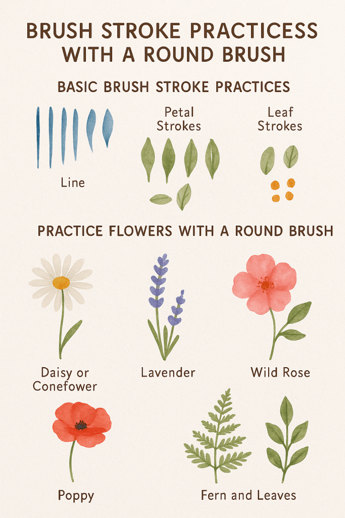
Brush work
Brush work for flowers using a round brush and a filbert brush
Understanding the Round Brush
- Tip: Use for fine lines, stems, and details.
- Belly: For broader strokes, petals, and leaves.
- Full stroke: Press and lift to create petal or leaf shapes.
🌼 Basic Brush Stroke Practices
1. Line Practice
- Load the brush with color and practice thin to thick lines.
- Try drawing stems using just the tip.
- Vary pressure to get tapered lines for stems or vines.
2. Petal Strokes
- Press and lift: Start with the tip, press down to widen, then lift to create a teardrop shape. Perfect for petals like daisies or poppies.
- Pivot stroke: Anchor the tip and twist or arc the brush slightly to make curved petals like wild roses.
3. Leaf Strokes
- Single press: One press with a round brush makes a simple, oval leaf.
- Pull and lift: Start at the base, press down as you move outward, then lift for a pointed end.
- Double-stroke leaf: Two strokes meeting at the tip make wider leaves (like clover or foxglove foliage).
4. Dotting
- Use the tip of the brush to make dots for flower centers or small buds (e.g., baby’s breath or Queen Anne’s lace).
🌸 Practice Flowers with a Round Brush
1. Daisy or Coneflower
- Use the petal stroke repeatedly around a central dot.
- Paint petals with quick, even press-and-lift motions.
2. Lavender
- Use small dot strokes in an upward curve.
- Stack tiny dots or short lines to mimic clustered blooms.
3. Wild Rose
- Use rounded pivot strokes for the five soft petals.
- Add a yellow dot center with the tip of the brush.
4. Poppy
- Use looser, rounded strokes with more water.
- Let edges bleed a bit to suggest delicate texture.
5. Ferns and Leaves
- Use tip for the central vein.
- Add side strokes with press-lift motion for leaflets.
🖌️ Tips for Success
- Use different pressures to experiment with petal or leaf shapes.
- Practice on scrap paper first before creating a full composition.
- Let layers dry before adding detail to avoid muddy colors.
- Try using wet-on-wet for softer, flowing effects and wet-on-dry for sharper details.
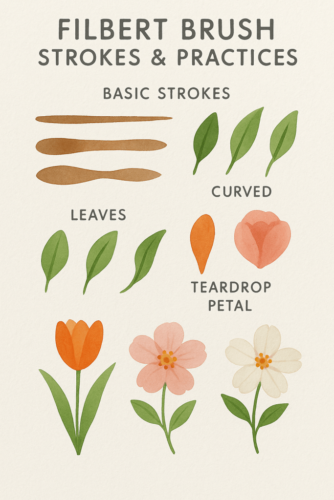
A filbert watercolor brush combines characteristics of both flat and round brushes, making it highly versatile—especially for painting organic shapes like petals, leaves, and soft edges. Here are the advantages and how you might practice with one:
✅ Advantages of a Filbert Brush
- Rounded Tip: Creates soft edges without harsh lines—ideal for natural elements like flower petals and animal fur.
- Controlled Blending: Great for smooth color transitions and layering.
- Petal-Friendly Shape: One stroke can form a full petal or leaf with a single press-and-lift motion.
- Versatility: Can handle fine lines (with the tip), broad washes (with the belly), and curved strokes (due to its shape).
- No Hard Corners: Unlike a flat brush, the rounded end reduces the risk of square edges in your painting.
🖌️ Practice Sheet Ideas for Filbert Brush
Here’s what a good filbert brush practice sheet would include:
- Basic Strokes:
- Thin tip lines
- Full belly swipes
- Press and lift strokes for petal/leaf shapes
- Leaf Shapes:
- Single press leaf
- Double-stroke leaf
- Curved leaves using a twist
- Flower Petals:
- Teardrop petals with one stroke
- Rose petals in layered form
- Blending Exercises:
- Wet-on-wet gradients
- Feathered edges
- Mini Wildflower Studies:
- Tulips
- Wild roses
- Dogwood blossom
A filbert watercolor brush combines characteristics of both flat and round brushes, making it highly versatile—especially for painting organic shapes like petals, leaves, and soft edges. Here are the advantages and how you might practice with one:
✅ Advantages of a Filbert Brush
- Rounded Tip: Creates soft edges without harsh lines—ideal for natural elements like flower petals and animal fur.
- Controlled Blending: Great for smooth color transitions and layering.
- Petal-Friendly Shape: One stroke can form a full petal or leaf with a single press-and-lift motion.
- Versatility: Can handle fine lines (with the tip), broad washes (with the belly), and curved strokes (due to its shape).
- No Hard Corners: Unlike a flat brush, the rounded end reduces the risk of square edges in your painting.
🖌️ Practice Sheet Ideas for Filbert Brush
Here’s what a good filbert brush practice sheet would include:
- Basic Strokes:
- Thin tip lines
- Full belly swipes
- Press and lift strokes for petal/leaf shapes
- Leaf Shapes:
- Single press leaf
- Double-stroke leaf
- Curved leaves using a twist
- Flower Petals:
- Teardrop petals with one stroke
- Rose petals in layered form
- Blending Exercises:
- Wet-on-wet gradients
- Feathered edges
- Mini Wildflower Studies:
- Tulips
- Wild roses
- Dogwood blooms
April lesson- Mountain Scene
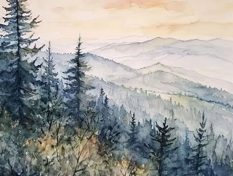
Painting ribbons of mountains in watercolor involves layering distant mountain ranges in soft, flowing forms to create depth and atmosphere. Here are some guidelines to achieve this effect:
1. Plan Your Composition
- Sketch out the basic shape of the mountain layers lightly with a pencil.
- Decide on the placement of the horizon and how many layers of mountains you’ll include.
- Arrange mountains in overlapping layers to create depth.
2. Use a Graded Wash for Depth
- Distant mountains should be lighter and more faded (less pigment, more water).
- Closer mountains should be darker and more defined (more pigment, less water).
- Use a wet-on-wet technique for soft, misty effects in the background.
- Use a wet-on-dry technique for sharper edges in the foreground.
3. Work from Background to Foreground
- Start with the farthest mountains using a very diluted wash.
- Let each layer dry before adding the next to maintain crisp edges.
- Gradually increase pigment intensity and detail as you move forward.
4. Use Cool and Warm Colors
- Distant mountains often appear cooler (blues, purples, grays).
- Closer mountains can have warmer tones (greens, browns, even hints of warm earth tones).
- Adjust color temperature to enhance atmospheric perspective.
5. Add Soft Transitions and Mist
- Use a damp brush to soften edges in distant mountains.
- Introduce a light wash of white or pale blue at the base of distant layers to suggest mist or haze.
6. Suggest Texture Without Overworking
- For distant mountains, minimal detail is best—let soft washes create the illusion of depth.
- For closer mountains, use dry brush strokes or a sponge to create rocky textures.
7. Keep the Flow Natural
- Avoid making the layers too symmetrical or evenly spaced—let the shapes be organic and varied.
- Use a combination of soft, flowing curves and angular peaks for natural variation.
Would you like guidance on specific color choices or brush techniques?
4o
You said:
color choices
ChatGPT said:
For painting ribbons of mountains in a watercolor scene, color choices play a crucial role in creating depth and atmosphere. Here’s a general guide on how to choose and layer colors effectively:
1. Background Mountains (Farthest Layers)
- Colors: Light, cool, and desaturated tones to create a sense of distance.
- Suggested Palette:
- Ultramarine Blue + a touch of Burnt Sienna (to create a soft blue-gray)
- Cobalt Blue + a bit of Alizarin Crimson (for a distant purplish haze)
- Payne’s Gray (diluted for a misty, neutral tone)
- Technique: Use a wet-on-wet wash to keep the edges soft and blend smoothly into the sky.
2. Midground Mountains (Middle Layers)
- Colors: Slightly darker, with hints of warmer tones but still relatively cool.
- Suggested Palette:
- Ultramarine Blue + Burnt Sienna (a slightly stronger mix than the background)
- Cobalt Blue + Dioxazine Violet (for a cooler midground)
- Phthalo Blue + Neutral Tint (for a cooler, slightly deeper tone)
- Technique: Use a wet-on-dry technique for more defined edges but keep some areas softened for atmospheric perspective.
3. Foreground Mountains (Closest Layers)
- Colors: More saturated, warmer, and detailed.
- Suggested Palette:
- Ultramarine Blue + Burnt Umber (for deep earthy tones)
- Phthalo Green + Burnt Sienna (for deep forest greens)
- Indanthrene Blue + Quinacridone Gold (for deep, warm shadows with a golden glow)
- Sepia or Burnt Sienna (for rocky textures)
- Technique: Use a dry brush or sponge technique to create rocky textures, and layer details for depth.
4. Atmospheric Enhancements
- Mist & Haze: Use diluted Cobalt Blue or Payne’s Gray with lots of water at the base of distant mountains.
- Sunset Glow: If adding a warm light effect, introduce Naples Yellow, Quinacridone Gold, or Rose Madder near the horizon, softly blending into the cooler tones.
- Shadow Areas: Mix Ultramarine Blue + Alizarin Crimson for cool shadows, or Payne’s Gray for deeper tones.
Would you like help with a specific mood (sunset, misty morning, winter scene, etc.)?
4o
Search
Reason
ChatGPT can make mistakes. Check important info.
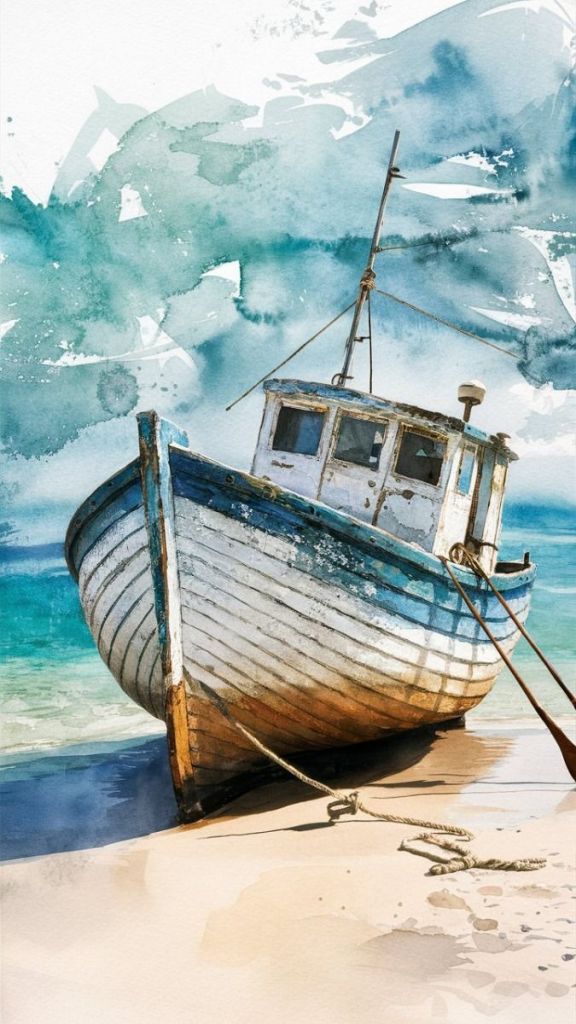
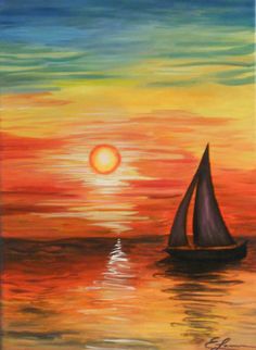
March Boat Project
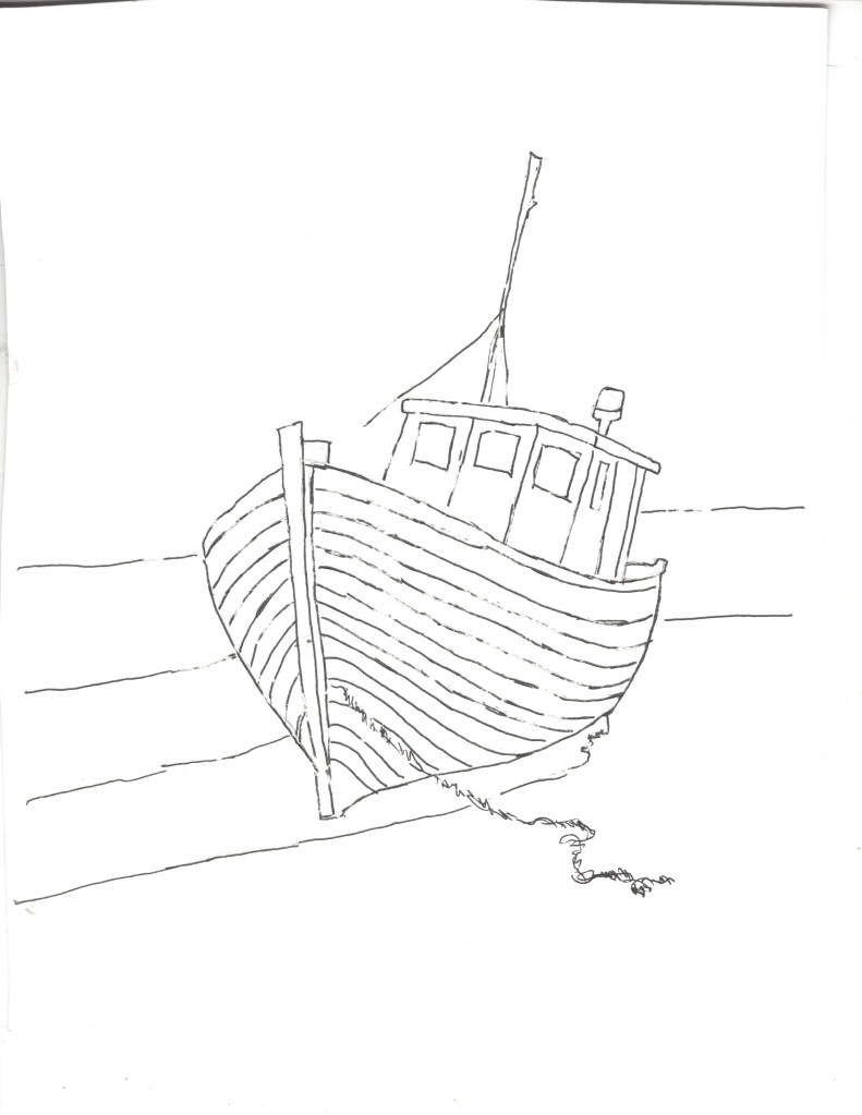
Sky: Wet the sky around the boat with a large brush. Try not to get water on the boat. Mix a wet puddle of an aqua blue and with that large brush paint the sky. while it is still wet take a Kleenex and crumble it in your hand in a long shape. Decide where you want a cloud and press down. Let this dry.
Sand below the boat: You want a very light value of brown. Wet the area below the boat. You are going for a sand look. So start with a puddle of water and barely touch brown to it. Paint that lower sand and it doesn’t matter if the color is uneven. You might even plan to leave a little white area.
Ocean: Refer to your reference painting to determine what is ocean and what is sand and what is the shadow under the boat, Mix an ultramarine blue and a touch of green to get a blue green ocean color. Remember to test your mixed color on your scrap watercolor paper to see if you need to add more blue or more green.
Boat:Your colors to mix are ultramarine blue (several values -add more water to original puddle to get a lighter value) and a light value of burnt Sienna in a separate puddle. You are not mixing these two colors. Mix a third color of blue and burnt Sienna as a dark value. This value will blend into the dark shadow under the boat. This technique is called lost and found edges. The shadow color will be a dark value of brown and blue. It is important to paint the bottom of the boat and the shadow at the same time so that the colors meld together without a hard line.
Refer to the painting to see where to paint the blue. Where you see white in the painting, leave the area untouched with water or color. When you paint the windows, you might want to include a little of that aqua sky color. The right side of the boat cab should be lighter to give a 3-D effect. Don’t worry about any of the lines. Once the color has been applied, you will add the lines with a gray watercolor pencil.
The bottom of the boat has become rusted from the ocean water. Wet the area above that brown stain and paint a light value of burnt Sienna. This will give a soft edge to that stain shape.
To finish up, use a gray watercolor pencil to draw the lines on the boat and the lines above the boat cab.
March Mixed Media Project
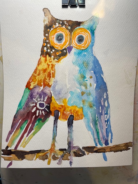
Owl
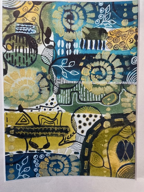
As adults we forget to play with art as we did when we were children. The purpose of our next class is to play with paint and mixed media and not to create a “painting”. You will be given watercolor paper with a funky animal . Everyone has a different animal. You will have a basket with a limited (4) color palette of homemade watercolors, watercolor chalk, a colored pencil and a black marker. You will also have a reference photo as shown below to give you ideas.
- Decide how you can break up the space with geometric or organic shapes. These shapes should be interesting and varied in size. Draw these shapes with a pencil. I would not outline the shapes with a black marker.
- Paint each shape in a flat color. You could leave 1 or more shapes white. Remember, do not paint two colors next to each other at the same time until one of the colors is dry, so that the two colors do not run together.
- Refer to the reference page to get ideas on what marks you will make in the shapes. Once the first layer of painted shapes are dry, you will be making marks with a colored pencil or black marker (or both).
- Decide if you need to outline the outer shape. It may be fine without an outline.
- The most important thing is to have fun and be ready for any result good or bad.
Winter Class Project
Winter Project
Snowmen always make me smile. I hope this painting will make you smile. Remember the process is more important than the product. My key to making paintings look like a watercolor painting is to thin your watercolor with water. I usually wet large areas before applying the watercolor color. However, if you mix the color until it is soupy like skim milk, you can skip wetting it first
- SKY and background around the snowman-turquoise, cobalt blue. Mix very soupy wells of each color. Wet the area and float in the blues. While this is still wet, cover the entire painting with a paper towel with a pattern. Leave this on until dry. This might work better on hot press paper. Alternate ideas: paint blue and sprinkle with salt; or paint blue and when dry splatter with liquid white acrylic.
- Hat-Paynes Gray, red, green. Dilute the Paynes gray until it is a light gray. The top of the hat will be a lighter value than the lower part of the hat. When you paint the red hat band, leave a sliver of white between the hat and the band. Paint the berries a darker red, alizarin crimson or add a little purple to the red. The holly is sap green..
- Snowman-Just leave the white paper for the snowman. You can add some very light pink or red for the cheeks. I would wet the area around where you will add the pink so that it is soft and diffused. Paynes Gray for the branches and eyes, mouth and buttons.
- Scarf- Refer to the reference painting above. Use a wax crayon to make the stripe pattern. Paint red over this.
- Bird-Red mostly, add a little darker red to indicate wings. Yellow beak, and small paynes gray around face.
Fall Paintings
Truck in the pumpkin patch
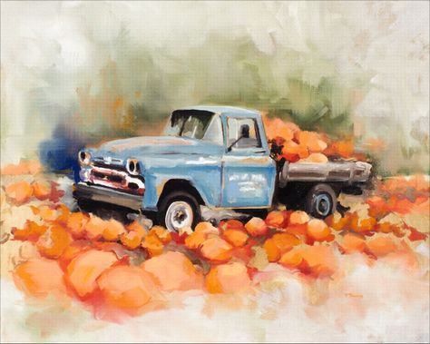
The lesson today works to illustrate the technique called lost and found edges. We are also working on hot press watercolor paper. Usually we work on cold press paper. Below the pumpkin and chipmunk painting ( online at ravin studio.com ,go to watercolor lessons),there is a description of the difference between the two watercolor papers.
Palette: Sap green, ultramarine blue, turquoise, orange, red, brown, and Paynes Gray
- Wet the area over the truck. With a large brush, float in sap green starting at the truck and working upward. You want to see the strokes, not a smooth background. While this is still wet, float in a small area of blue and orange.
- The pumpkin patch and the pumpkins in the truck are painted very loosely. Basically, just paint the overall shape of the area. When this dries, use a darker value of a reddish orange to suggest pumpkins.
- Switch to a smaller brush. Use cerulean blue to paint the truck. Notice there are several white areas. Keep the water and paint off the areas you want to stay white. There are not distinct lines as many of the highlights and body color merge together in a loose manner, especially around the hood.
- Lost and Found Edges on the underside of the truck. Under the truck is a dark value of brown or Paynes gray. Some parts of the truck, especially around the wheels blend in with the shadows, so some parts you see (found edges) parts of the wheels are (lost) in the dark shadows.
Pumpkin and Chipmunk
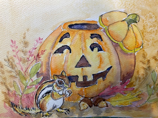
The difference between cold press and hot press watercolor paper lies in their texture, feel, and manufacturing process. Here’s a breakdown of the two:
1. Cold Press Watercolor Paper
- Process: The paper is pressed between cold metal rollers, which creates a moderate texture. It’s not heavily smoothed, retaining more surface irregularities.
- Texture: Has a slight tooth (texture) that helps hold water and pigments, making it ideal for washes and layers.
- Finish: Often labeled as “NOT” (meaning “Not Hot-Pressed”) by manufacturers.
- Best Use: Suitable for most watercolor styles, including both detailed and loose paintings, because it balances texture and absorbency. Artists enjoy it for landscapes, florals, and mixed techniques (like pen and wash).
- Absorption: Moderately absorbent, giving the artist more control over water and pigment flow.
2. Hot Press Watercolor Paper
- Process: Passed through heated metal rollers, which compress the surface, making it much smoother.
- Texture: Very smooth (minimal tooth), almost like regular drawing paper but thicker.
- Finish: Ideal for precise details, smooth washes, and work that requires fine lines or pen and ink.
- Best Use: Great for botanical illustrations, detailed portraits, and ink or pen work, as the smooth surface allows for fine control.
- Absorption: Less absorbent than cold press paper, which can make watercolors behave differently, often leading to more defined edges or pooling of pigment.
Summary of Differences
| Feature | Cold Press | Hot Press |
|---|---|---|
| Surface Texture | Slightly textured (toothy) | Very smooth |
| Best for | Loose or layered techniques | Detailed, precise work |
| Water Absorption | Moderate | Lower |
| Pigment Flow | Softer edges | Crisper edges, less blending |
| Use Cases | Landscapes, mixed media | Botanical art, pen & ink |
Ultimately, the choice depends on the artist’s style and the effect they wish to achieve. Cold press is more versatile, while hot press lends itself to fine, controlled work.
4o
Download the latest iOS or Android app to try advanced voice mode
Get more natural, real-time conversations with advanced voice. Senses and responds to humor, sarcasm, interruptions, and more.
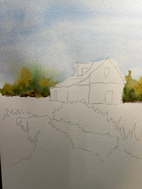
Barn Reflected in Pond-September
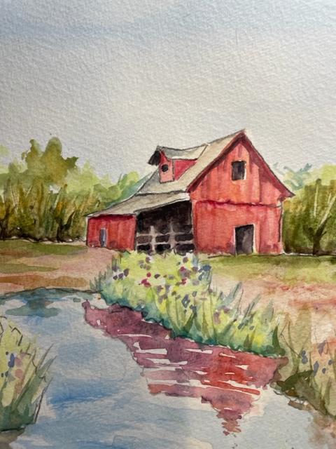
Sky and Trees
Lesson of the Day -Background Trees wet-in-wet
Background Trees (Wet-in-Wet)
Mix puddles of 4 colors: Cerulean blue, Sepia Brown, Sap Green and Yellow Orchre. Blue is a wetter puddle.
- Wet the sky with a large brush. Do not get water on the roof of the barn. Using a large brush float in blue using strokes side to side and top to bottom.
- While the sky is still wet, using a small brush, paint in an irregular line of brown at the bottom of the tree line.
- Follow that with sap green on and above the brown.
- Then add yellow orchre on and above the green.
- Doing this you are keeping the paint off the barn. If you accidentally get paint on the roof or barn, blot it off with a paper towel before it dries.
Foreground-Ground below the barn
Use small to medium size brush. Wet the area first so that the shadows will blend in and not look like magic marker marks. Use light values used in the trees. Refer to the reference photo to place colors.Darker colors near the bottom of the barn. You need the light brown or yellow ochre near the weeds by the weeds so that they will show up.
Weeds-
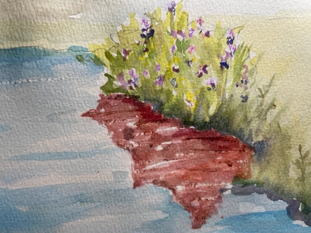
As you paint the greenery of the weeds, leave random circles of white paper.Dot in some flower blooms- yellow, purple, etc. Vary light values of weeds (yellow and green) with vertical strokes. Put darker value of green or brown near the base of the weeds.
Barn Reflection
Less is better than more. Mix a puddle of light red. Paint in the shadow shop with vertical strokes. Leave some slivers of white paper. Paint a darker value of red near the bottom of the weeds. Hint: One Way to get a white sparkle back is to scape across the paper with a razor blade or exacto knife.
Rules of Thumb for Painting Water Reflections
- Whatever is dark on dry land will be lighter in the water.
- Whatever is light on dry land will be darker in the water.
- Colors become less saturated in water reflections. …
- Details are left out. …
- Avoid all hard edges in water reflections
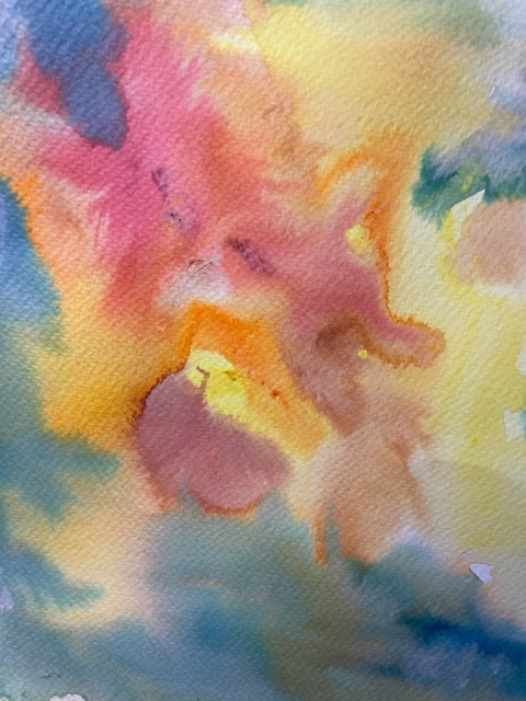
Sunflower Painting
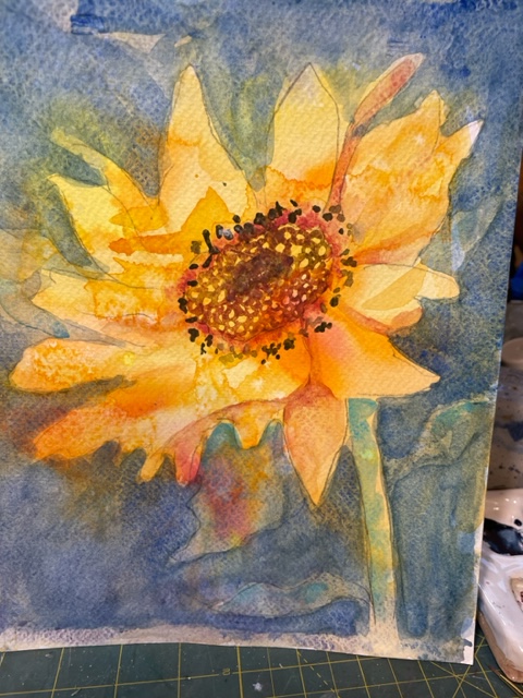
August’s lesson is a sunflower painting which emphasizes negative painting and underpainting. Palette colors are various shades of yellow and orange ,red, brown, and ultramarine blue.
- Wet the entire paper.
- Have several values and shades of yellow, orange and red mixed in wells.
- With a large brush, in an abstract manner, let the colors flow into the wet area. Do not plan. Do not stir the colors together.
- Let that dry.
- Using a photo or other reference material of a sunflower, draw a sunflower in the center of the paper. Ignore the shapes or color of the underpainting.
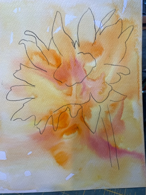
- Mix a skim milk consistency of blue. Test your color on your scrap paper going over the black magic marker line. If you still see the line beneath your paint you are good.
- Negative painting: Paint all around the sunflower and stem.using a # 6 or#8 brush. The sunflower will pop out. Let that dry.
- Refer to reference photos to decide where you want to draw the leaves. Again, try to ignore the underpainting. If some of your leaves are red, that is fine.
- Glazing:Now paint around the flower again with the same blue and add the leaves that you will paint around. To add depth, you could draw a few more leaves and then with the same blue , paint around the sunflower, the first leaves and now the second leaves.
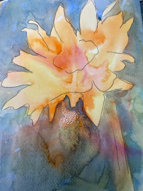
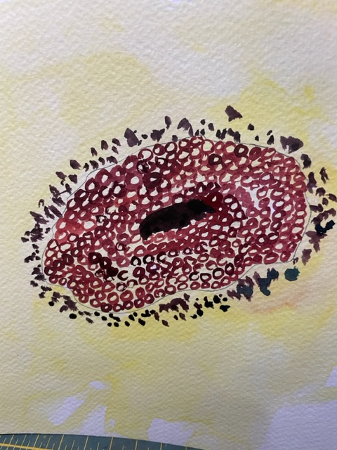
- Refer to the reference photo to add a darker value of red to separate and define the petals. This is important. Do not make a magic marker like line between the petals. When you make a line, immediately soften the inner edge with water to make a soft line. With the #2 brush go into a dark brown and paint cheerios, leaving the middle of the cheerio the underpainting (negative painting. With that same dark brown or red, use the point of the #2 brush and stipple (punch) the dark dots on the petals around the center. Use a dark value of brown to paint an eclipse in the center of the middle shape.
Wolf Painting
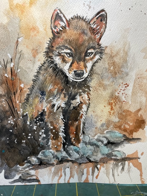
Wolf Lost and Found Edges and Lifting and Creating Paint Runs
Yikes, What a complicated design. Skills to be learned in this lesson are :
- Creating lost and found edges
- Blending several colors with wet washes together
- Using a wax colored pencil to mask areas
- How to lift watercolor from the area which has been covered with the pencil
- How to blow paint which has been applied in a puddle with a straw
- Your color palette is yellow ochre, raw sienna, burnt Sienna, raw umber and Paynes gray,
- Look at the pencil design on the watercolor paper and refer to the color copy. Adjust any lines or shapes to make it your own. The shapes must make sense to you.
- Work on the background first. There are two versions here. The simple version is to wet the area with your large brush with water and then float in burnt Sienna to get a solid background. The more challenging version is to refer to the color reference. Mix several puddles in your mixing spaces raw Sienna, burnt Sienna, and raw umber. Use your large brush. Wet areas similar to the shapes in the background of the reference photo. Float in the three colors so that the colors appear separately but flow together. As you get to the area to the bottom left, use a darker raw umber. Refer to the reference to mesh that in with the hinny of the wolf.
- Mask out the white areas of the wolf with the white colored pencil. A map is given at the bottom.
- Paint the wolf using all of the colors listed above referring the reference. First paint the darkest areas with Paynes gray using the small brush.Your colors should be very wet (skim milk consistency). While the paint is still wet lift the color from the white areas. Your smaller brush should be damp. With short sweeping strokes remove the paint. Wipe that off on a paper towel. Make a second sweep.
- Under the rocks paint a very wet line of gray. Turn the painting upside down and blow on the puddle to make paint streaks or runs.
- With a black marker go over the bush lines. Splatter the area of the bush with very wet white gouache. Use your large brush in the puddle of white gouache and tap the handle of the brush over the areas that you want the splatters.
- Once the body of the wolf has dried, you may need to glaze over some areas to darken them.
I was concerned that this might be difficult for the students, but they assured me that they liked a challenge. There were several new techniques introduced.
American Flag
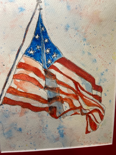
This July lesson at the Hendersonville Senior Citizen watercolor glass featured painting using the grisaille method, beginning with a gray value underpainting and seven ways to use watercolor pencils. Watercolor pencils have many advantages. The pencils can be bought in sets up to 72 colors or bought one pencil at a time. Compared to buying tubes of paint, the pencils are much cheaper. There are student grade pencils and brands which will be richer in color such as the Derwent brand. The tins of watercolor pencils are easy to travel with. You can even use a special water brush pen that lets water flow from the brush as you blend the color from the pencils on your paper, so you don’t even need a jar of water. As you buy the pencils, look for an image of a paint brush on the side of the pencil. You will also want to purchase a small pencil sharpener (not an electric pencil sharpener). The pencils work better for small paintings and you can use a lighter weight watercolor paper (90 lb. as opposed to 140 lb.
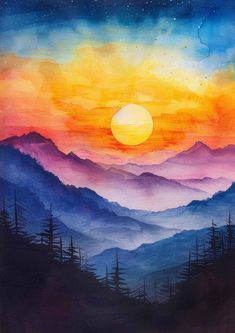
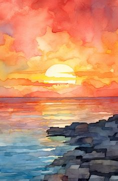
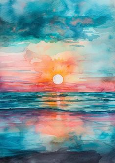
Mountain Sunset June 21 Painting
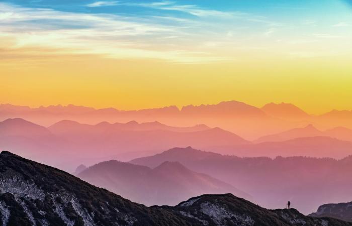
How to Paint a Sunset
1. Gather Your Supplies: You will need watercolor paper, a basic set of watercolor paints, a couple of brushes (a large flat brush and a round brush), a jar of water, and some paper towels
2. Sketch the Horizon: Lightly draw a straight line across your paper where you want the horizon to be. This will separate the sky from the land or water in your painting.
3. Wet the Paper: Using your large flat brush, evenly wet the area above the horizon line with clean water. This technique, called wet-on-wet, allows the colors to blend smoothly.
4. Start with Light Colors: Pick a light yellow and gently apply it near the horizon line. This will be the lightest part of your sky.
5. Add Warm Colors: Gradually introduce orange and then red above the yellow, blending each color into the next. Keep the colors lighter near the horizon and darker as you move up.
6. Blend in Cool Colors: At the top of the sky, blend in some purple or deep blue, merging it into the red to mimic the transition of colors in a real sunset.
7. Paint the Water/Land: If your sunset includes water, mimic the colors of the sky in a horizontal direction below the horizon. For land, a simple dark silhouette of hills or trees can work wonderfully.
8. Add Clouds (Optional): With a clean, slightly damp brush, lift off some paint where you want clouds to be. You can also add soft touches of pink or orange to suggest clouds reflecting the sunset’s colors.
9. Finishing Touches: Once the painting is dry, you can add details such as birds, a sun disk, or further define the clouds with a smaller brush brush
Lessons below are presented from oldest project to the newest project taught at the Hendersonville Senior Citizen Center. The heron is a June painting.
Heron Watercolor
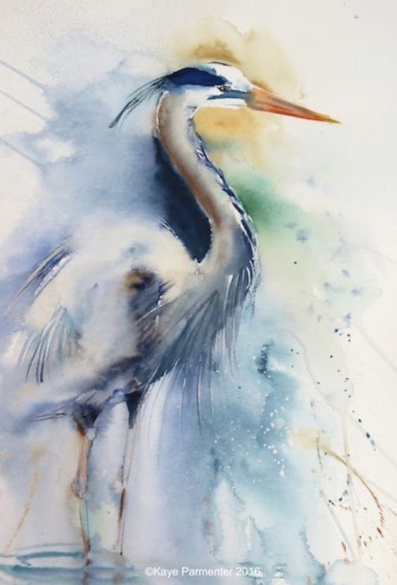
This is a very painterly representation of a white heron. Most of the painting is on the outside of the bird. Basically this is negative painting. The image of the bird is mostly the white of the watercolor painting.
Directions:
Mix wet colors in a palette area: Quin gold, blue and turquoise. Wet the area outside of where you are going to place the color. Refer to the large reference photo for color placement. Of course, you don’t have to copy exactly. Just be loose and place colors next to each other and let the water do the work. Let this dry. Refer to the large photo or the set of real photos to suggest the components of the bird. Again, this is loose and absent of painting every feather.
Heron Greeting Card
Tape border of the card with 1/4 inch masking tape. Refer to any of the references to paint the heron and the background. Colors are dark blue, gray, and quin gold. Use your smallest brush #2 to paint the bird or use a colored pencil for detail. The cattails are brown
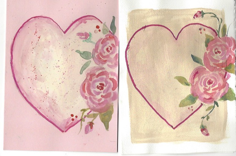
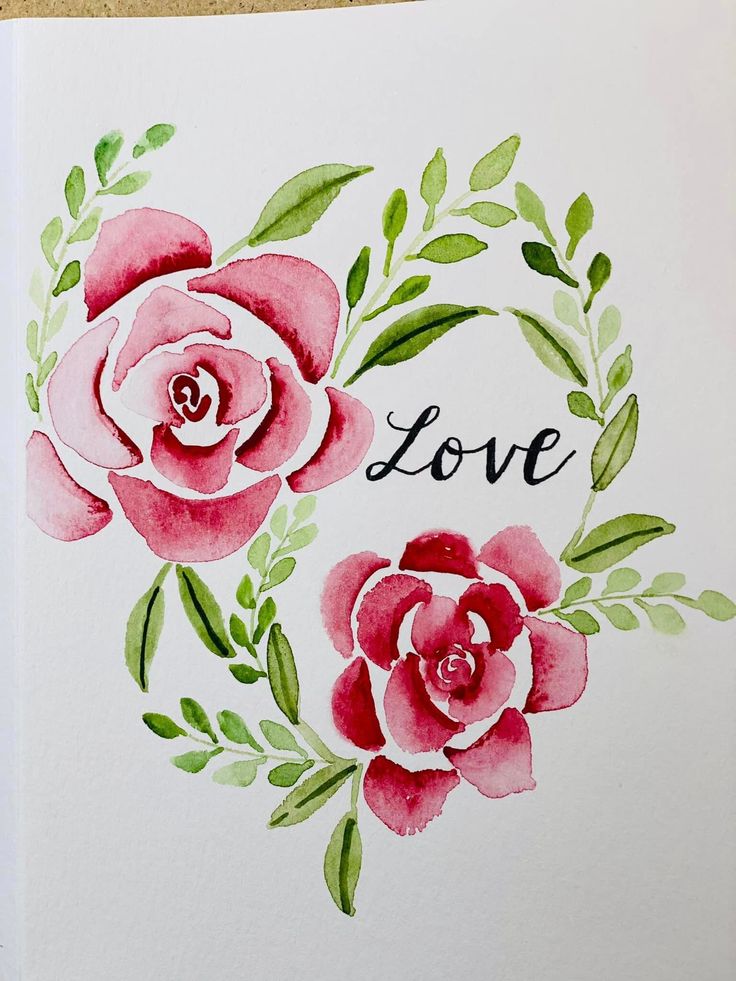
Project Valentine Card
ravinstudio.com for my art projects
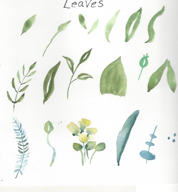
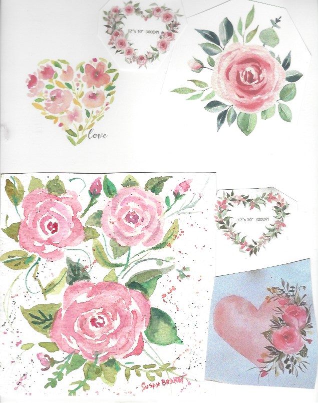
Valentine cards are a great way to show someone other than your significant other that they are cared for. As you practice this rose, think of someone you might not have connected with for a while and mail it to them. I have several versions of a heart card. I started by just practicing on scrap paper creating a rose. Actually, I liked the practice sheet so much that I plan to frame it as a mini painting. I use watercolor cards, but you could just fold the watercolor paper you have using an old card as a size reference. Make a heart template by folding paper, drawing a half of a heart, and cutting that out. Lightly trace the heart on your card. Decide where you want two to four big roses and very lightly draw irregular roundish circles to remind yourself on the placement. Refer to some of the instruction sheets as you begin the rose, start with a darker pink or red in the center and build the petals outward. The fun part comes as you fill in around the rose. Make up flowers from your memory or refer to some of the reference sheets. Just remember, you don’t have to copy any design completely. You might also want to paint a rose on the envelope. I painted several versions of this heart with roses and I like the following card best.
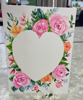
The cards below were my first attempts.
Directions for Paining a Rose
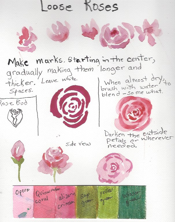
Reference Sheet
This is my favorite for simplicity.
Project #2
Winter Barn Scene
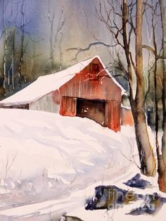
Winter Barn
Life is like a box of chocolates. You never know what you’re going to get. This painting exercise is like that. You will be learning to paint wet-in-wet and also scraping into wet and damp paint. It may not turn out like anything you anticipated.
Go in with the attitude that it is a learning experience and maybe not a joyous painting to frame (or it might turn out absolutely gorgeous). Remember, when you paint a “dog”, you can always paint on the back of the painting.
Skill Builder 1: Mixing color on the paper instead of palette.
- Mix three or four separate puddles on your palette (milk consistency) Ultramarine blue, yellow, and dark green. Maybe purple or whatever is your favorite color.
- On practice paper wet a large area (shinny)
- Drop the colors from your puddles onto the water. Let some of the colors overlap and let some colors remain the dropped color. Visualize how this could be foliage. You may need to stir this a little with your brush. Do not stir it so much that you have one solid color.
- This technique is called “wet-in-wet”.
Project steps:
- Sun circle behind the barn..Wet an area behind the barn. Drop in some diluted yellow. If it is too bright, dab it with a Klenex
- Let this dry.
- Use your larger brush.Now wet the area behind the barn. Keep the water off of the barn roof. I like to cover the roof top with masking tape to get a good clean line. So you will have to use scissors to shape the pieces.. Hint. Once you pull your tape strip off the roll, tap it on your pants to get a little of the tacky off. Also, do not remove tape from any wet area of paint as it will tear your paper.
- Drop blue and yellow in the wet area. Drop a little of the dark green near the base of the water puddle. Have fun- drop in your favorite color. If any of the blue or yellow gets on the sun, gently blot with a Klenex.. You want this color to be a value 6 (fairly dark). It will need to have color for the scrapings to work. Also, watercolor dries lighter.
- While this is still damp (not shinny), scape up some tree trunks. Refer to the reference photo. Scape with a blunt but not sharp object like a credit card.. This step is easy to over do. Also, it takes practice (and patience) to get the effect you want. If you scratch when it is shinny, you get dark lines, If you let it dry so that it is damp, you get white lines. You want both.
- Gently remove the tape from the roof and leave the roof blank for now.
- Barn: Clean off your background puddles from your palette. Now mix a pinkish red, an orange and either a alizarin crimson (dark red) and a purple. Switch to your smaller brush. Go into one of your red puddles and pull it down to imitate barn planks. Vary the colors you pull down. Careful, this could look like a circus tent. So wet colors next to each other will blend together. You may need to even use the side of your large dry brush to blend the colors together. While this is still wet, scape lines down to suggest planks. Refer to the reference painting and paint in the barn windows and doors. You could just fill in with a dark color, but if you are going for a wow look, put is couple of colors and let them blend. Don’t stir that it becomes just one color.
- Snow: Mix up a light value of ultramarine blue and use just a touch of the diluted purple (two separate puddles). Refer to the reference to paint the hill shape. Leave some area white at the top of the hill. Put a light value of the blue from the road (interesting shape). You could just leave the roof white or add a touch of that snow shadow In some places.
- Trees: Mix a brown with a little of the ultramarine blue to gray it down. Paint a little yellow ochre down the left side of the tree trunk. While this is still wet add the darker brown to the right . Add the branches (minimally).
Note: Your painting is not going to look like the reference painting as this was a three hour painting that we are doing in an hour and a half. Plus there are some intermediate painting techniques. So learn some new techniques, enjoy the painting process and if it doesn’t turn out gorgeous don’t be disappointed with yourselves.
Scratching in wet paint Practice
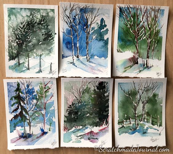
Experiment with things you have around the house to scratch lines in damp paint. If the paint is shinny wet, you will get a dark line. Wait a few minutes and while the paper is damp, you can scratch white lines. Experiment in pulling down or scratching up. The edge of a credit card works well as a tool. I have included a set of winter scenes to inspire you.
Practice
Sometimes you may not want to attempt a painting. Just play with paint and mark making. No pressure.
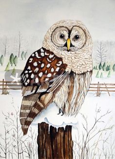
Project #3 Snow Owl
Art is a process not a product. Relax and enjoy the process
The next project is a snow owl on a fence post. This is my painting. The background is a light value of Paynes Grey. My printer gives the background a brownish look.
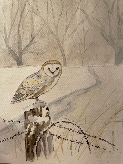
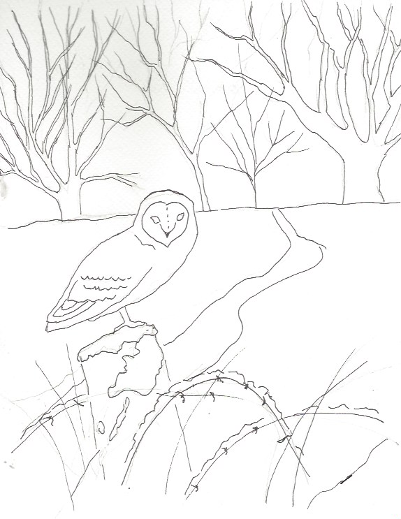
Line Drawing: Print off the line drawing below. With a #2 pencil, put a heavy dark layer of the graphite on the back of the line drawing. Tape the drawing on your watercolor paper and trace the design.
Palette: Paynes Grey, Burnt Umber, yellow or Quinicrodrone Gold. Make a large puddle of Paynes Grey. The photo looks brown, but it is a very light value of grey. Also, you will need either white gouache or acrylic paint to splatter on for snow. Colored pencils: dark brown, blue, yellow ochre and also a dark grey or black.
Step One: Wet the sky area. Paint the sky area down to the snow. You are painting a flat area over the tree drawing. Let that dry. Add more grey to your grey puddle and paint the trees.
Step Two: Paint the road area with that same grey. It looks better if you are streaky and follows the flow of the road.
Step Three: Follow the reference in painting the owl. It is different values of grey and brown. This is a good time to use those pencils with sharpened to a good point
I mixed a little yellow with the brown to get a greenish gold at the top of the owl’s wing.
Step Four. Post and barb wire: With a dark value of brown, paint around the snow on the right side. Vary the value a little here, so that you get the feeling of bark. Use the brown colored pencil too. The snow on top of the post will not show up unless you put a hint of blue watercolor pencil at the top. Blend down with water. The barb wire is the dark black pencil or a Micron Black Marker. Be sure to put in the barbs. The weeds are best done with a rigger brush, but you could use a yellow ochre colored pencil.
Step Five Snow: Load up a toothbrush with either white gouache or acrylic paint. Use your thumb to splay the paint over the painting. It is good to practice this a little on scrap paper. If the paint is too thick, it doesn’t work well and if the paint is too watery , you could have big blobs of paint. If you get a blob, quickly blot with a paper towel or Klenex
Reference Photo
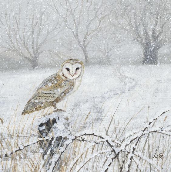
Reference Photo